As designers, it’s important that we can do things quickly and effectively. One key aspect of our agency workflow is the fact that we are almost always working in a team; this means that making sure we communicate our ideas with others in an intelligible and clear way is crucial.
Technological advances over the last few years have meant that we now design for desktops, tablets, mobiles and smart TVs. Almost any screen you use today can display a website – that’s amazing!
We don’t intend to talk about responsive design in this post, as that is a subject well debated on many other blogs. Instead, we are going to present the way that we, the team at Moove, have developed our design process and workflow to be extremely efficient for the whole group.
Like most website design agencies, we use Adobe XD, Sketch or Figma to create our mock-ups and we always create responsive designs for various tablets and mobile devices as standard.
Clear design file structure saves time
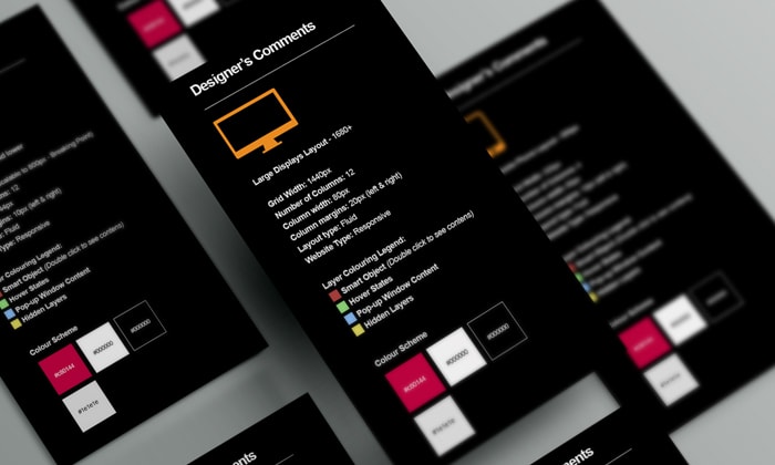
Having a clear sidebar that contains the main information about the design assists our development team.
That includes page width, the number of columns, targeted device, main colours and also a layer colour legend (Smart Object, Hover State, Pop-up, Hidden Layers).
The colour legend is very important as it makes it easier for the developers to identify specific elements of interactive website designs.
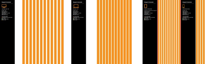
Most of the time, the design file accommodates three areas: desktop, tablet and mobile. Each of these areas is usually divided into 12 columns so that the design can be coded on bootstrap or any other modern framework. Sometimes we include four areas in the PSD file, as we want to show our clients and coders how the site looks on larger screens (e.g. 1920 pixels wide). If the project requires it, we include a tablet landscape view as well.
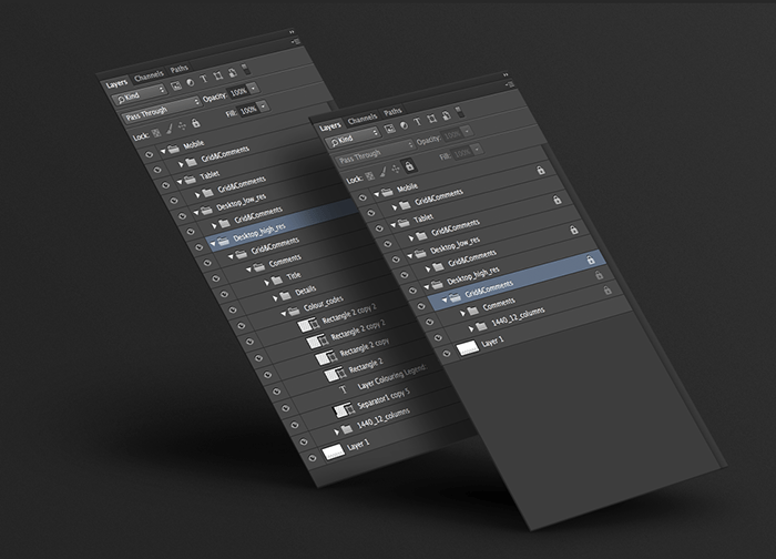
We’ve been conscious of the way we name the main layer groups, so naming conventions are in place as well. The layer groups that include the designs for a certain screen are always named by using the screen width and the number of layout columns. The comments layer group additionally includes sidebar elements of colouring legend and design notes.
Moove’s design file structure
One thing is for certain in web design: we will be continually revising and trying to improve the structure of our design files
From the design point of view, it helps our design team greatly when they can visualise the responsiveness of a site on different screen sizes and devices, all at the same time. From the coder’s point of view, they have all the information they require inside of the design file. The developers don’t need to clarify anything with the designers, and consequently, as a team we manage to reduce the design and development time needed to complete a project.
This website uses cookies so that we can provide you with the best user experience possible. Cookie information is stored in your browser and performs functions such as recognising you when you return to our website and helping our team to understand which sections of the website you find most interesting and useful.
You can adjust your preferences below.
Essential Cookies
Essential Cookie should be enabled at all times so that we can save your preferences for cookie settings. If you disable this cookie, we will not be able to save your preferences. This means that every time you visit this website you will need to enable or disable cookies again.
Google Analytics
This website uses Google Analytics to collect anonymous information such as the number of visitors to the site, and the most popular pages. Keeping this cookie enabled helps us to improve our website.
