Your website images can help you connect and communicate with your audience in a very powerful way. But, used in the wrong way, images can also be destructive and undermine your message. Neuroscientists at MIT have found that our brains identify images in just 13 milliseconds. The brain processes visuals 60,000 faster than words.
These are powerful facts that reinforce the importance of high-quality, appropriate imagery to get your message across.
Here are a few tips to help you make the most of your website images, and support and enhance your message.
#1 Be mindful of the quality and size of website images
Always use good-quality images. That means something much better than a smartphone picture. Even though these days some devices give you quite decent photographs, you can still do better.
For your side headers, use images at least as wide as your viewport, so you don’t stretch an image to fit your viewport. That can decrease its quality. Also, use landscape images rather than portrait. Portrait images might not fit your header area. (More later on this.)
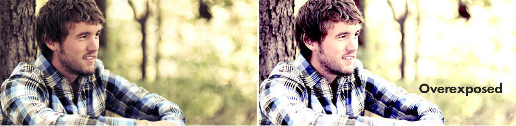
What about image size? The recommended resolution for screens is 72dpi. In print, it’s 300dpi, which means that the images are significantly larger. If you have a large image that was intended for print, you can avoid slow-loading issues by checking your image resolution.
You can convert image resolution in Photoshop. However, be aware that the image size in pixels will decrease as well.
#2 Follow a few basic rules of photography
The two important elements in photography that can make a great photograph are lighting and composition.
Good lighting is a must
Always make sure the light in your photograph is well balanced. This helps your users clearly see what you want them to see.
In portraits, make sure the subject’s face is visible and no unwanted shadows cover their face or creep behind them.
If your image shows a product, make sure that it is in focus and well-balanced with the background.
Composition is the key
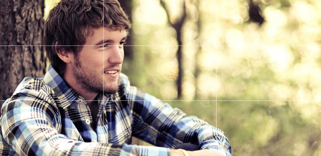
One of the main guidelines when taking photos is to follow The Rule of Thirds. We like to see images defined by a certain sense of order. One of these involves dividing images into thirds, with the subject falling at or along one of those divisions. Check this out in the image below.
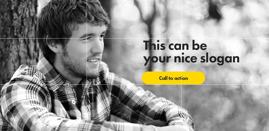
On the web, the rule of thirds comes in quite handy on cover pages. That’s because you’ll often have an image supported by a headline and a call to action. Choose an image that gives good exposure to the call to action. In this example, the subject is placed on the left side to leave the right side free for the call to action.
Quick tip: Nicely blurred backgrounds will always make the text more prominent.
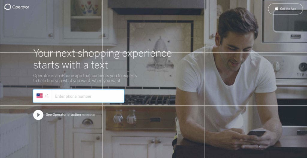
Here’s another example on Operator’s website. As you can see below, the image is composed of a person on the right side, leaving the required space for the call to action on the left.
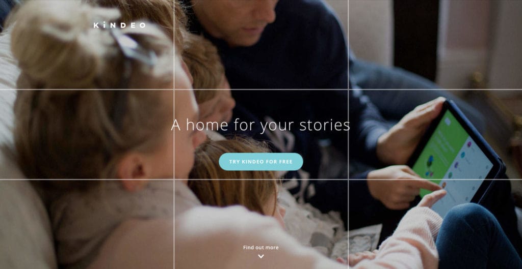
Sometimes, you can be creative and challenge the rules. You can place your text and call to action in the centre of the screen, for example, but you always have to keep readability in mind. The Kindeo website below does this well. The subjects are placed on the left, but the way the image is composed gives the option of placing the headline and call to action in the centre. Placing the tablet on the right also makes the picture well balanced.
#3 Balance your website images with your branding
To clearly define themselves, most brands use a balance of imagery and illustration, alongside their logos. The imagery that supports the brand becomes as strong as its colours and typography. The imagery also helps build a concept that can define the brand.
Big brands are easily recognisable by the photography alongside their logo. Below is an example from Poker Stars:
The Poker Stars composition makes things even more clear. The main, and most important, aspect here is the image’s dominant colours: they’re the same as those in the Poker Stars logo.
#4 Be unique – use images of real people instead of stock photos
Stock photography websites can be really handy. The web has huge databases of images, and search mechanisms have evolved, so you can find almost anything you’re after. But remember – you’re not the only one using those photographs. And, as your brand grows, you’ll want to be unique.
If you’re pushed for time and money, a stock photo website might be your best option. Spend some time searching and make a list of images you like. But once you have them, speak with your designer. They might give you advice on editing those images to avoid that ‘stock photo’ look.
But investing some money into custom photography is always a good practice. A photo shoot will take time and will cost much more than buying a set of images from a stock website – but you’ll be 100% sure that no one will use the same images as you. You’ll be unique.
#5 Always speak to your designer
We’re here to help! If you would like some advice on your image composition and how to make your photos shine on your website then please do get in touch, we’d love to hear from you.
This website uses cookies so that we can provide you with the best user experience possible. Cookie information is stored in your browser and performs functions such as recognising you when you return to our website and helping our team to understand which sections of the website you find most interesting and useful.
You can adjust your preferences below.
Essential Cookies
Essential Cookie should be enabled at all times so that we can save your preferences for cookie settings. If you disable this cookie, we will not be able to save your preferences. This means that every time you visit this website you will need to enable or disable cookies again.
Google Analytics
This website uses Google Analytics to collect anonymous information such as the number of visitors to the site, and the most popular pages. Keeping this cookie enabled helps us to improve our website.