Leading chipmaker ARM, predicted that their new products would render all computers obsolete and that by 2016, the world could be phone-only.
Although the prediction was slightly premature, the fact remains that an ever-increasing number of online activities are being carried out on mobile devices.According to Ofcom’s 2016 Communications Market Report, the proportion of people using their phones to access the internet has now reached 66% – an increase of 15%.
With the number of mobile users at an all-time high, companies must think carefully about how their website looks and functions on a smaller screen. Increasingly people are using their mobile phones to research products. So giving them a great mobile experience will almost certainly mean they’ll return to your website when they’re ready to buy.
Let’s take a look at what to consider when designing a mobile website:
#1 Responsiveness is key for designing a mobile experience
There’s a common misconception that a desktop website and a mobile website are two different things. This stems from the fact that, initially, they were.
Companies would put time and effort (not to mention money) into organising a website build, only to be told that they would then have to build a ‘mobile version’, essentially starting from scratch.
As more mobile devices were introduced to the market, all with different screen sizes, having a separate ‘mobile version’ of a website wasn’t enough to guarantee a user-friendly experience… and so along came responsive web design.
Building a responsive website allows you to use the exact same content as the desktop version, but present it in a way that maximises the user experience across a range of devices. As you can see from the example below, the content doesn’t change; it just shifts and rearranges to accommodate the change in screen size.
This delivers a consistent experience across all devices, something that we at Moove deliver as standard with all of our designs.
#2 Prioritise user experience
Websites can’t just be all style and no substance.
Advances in technology mean that companies now have more data at their fingertips than ever before. They can track how users come to their site, how they move around and most importantly, what they do next.
So why not use this data to your advantage when considering the design of your mobile website?
Given that there’s less screen space on mobile devices, it’s important that you use data to deliver the most relevant content to your users up front. By providing immediate access to the type of content that they’re searching for, your visitors will stay on your site for longer.
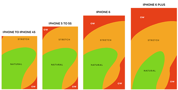
You should also consider the ‘gestures’ of your mobile visitors.
As explained by Google, gestures include touch mechanics (what fingers do on the screen, e.g. touch, swipe) and touch activities (the results of specific gestures, e.g. activate, cancel, zoom).
To ensure a seamless user experience, it’s important to incorporate simple ‘natural’ gestures into your mobile website to ensure that the user can get to where they want to go as easily as possible.
Adding gestures to your mobile site that are a ‘stretch’ to your specific audience will encourage them to look elsewhere for their content. It’s important to understand how your mobile visitors behave on certain devices and what gestures they’re likely to display.
Behaviours can include the user’s range of motion, e.g. whether they’re likely to be visiting your site while static or on the go, their comfort levels (are they in a rush, or feeling relaxed?) and what state of mind they might be in – for example are they likely to be experiencing a particular set of emotions when visiting your site?
#3 Don’t assume your mobile visitors are always in transit
If you were asked to give a description of a mobile internet user, you might instinctively picture someone walking down the street, on public transport or in a rush.
However, making these assumptions can be detrimental to your business – they can lead us to design websites that deliver the quickest possible solution, rather than the best one.
If a visitor is engaged with your content, they’ll stay on your site for however long it takes for them to feel satisfied. It’s, therefore, important to suggest additional content that they might be interested in to encourage them to keep reading.
If a user is constantly clicking back and forth between screens, they’ll soon become frustrated and leave, so it’s important that your website is built intuitively to encourage more interaction.
For example, if you run a news site, make sure that you offer related articles at the bottom of each post. If you sell products, show related products – always give them something else to read next.
#4 Make your content easy to read
Something so simple that’s so often ignored is the legibility of a website.
Your content can be valuable and intelligent and your design exquisite, but if your mobile users struggle to read the content, it’s a poor mobile experience and all is lost.
Try to use one font consistently across your website. Sans-serif fonts are particularly popular because of their legibility across various screen sizes.
Similarly, if your site offers advertising opportunities, make sure that any graphics scale to the size of the user’s screen. The last thing an advertiser wants is for their ad to be unreadable on mobile devices because it displays too small.
Make sure you give the correct specification to advertisers, including an example of how their ad will appear on the site so that they can adjust their design accordingly.
#5 Don’t forget the content management system
If you’re taking on the task of updating your website through a content management system (CMS), it makes sense to have this side of the website responsive too. Trust us; it’s so much easier to update a website’s content on the go if you aren’t constantly zooming in and out of a CMS!
WordPress comes with this capability already built in, which can save time, effort and cost in the long-term.
The most important thing to remember when designing a mobile website is to consider the user first and foremost. By truly understanding their behaviour while on your site, you can begin to build a mobile experience that encourages interaction and essentially drives more business.
Is your website optimised for mobile? If not, why don’t you get in touch with us to discuss how we can improve your website’s mobile experience.
This website uses cookies so that we can provide you with the best user experience possible. Cookie information is stored in your browser and performs functions such as recognising you when you return to our website and helping our team to understand which sections of the website you find most interesting and useful.
You can adjust your preferences below.
Essential Cookies
Essential Cookie should be enabled at all times so that we can save your preferences for cookie settings. If you disable this cookie, we will not be able to save your preferences. This means that every time you visit this website you will need to enable or disable cookies again.
Google Analytics
This website uses Google Analytics to collect anonymous information such as the number of visitors to the site, and the most popular pages. Keeping this cookie enabled helps us to improve our website.


