Claire oversees the operational side of the agency. She has over 15 years project management, sales and marketing experience and holds an MSc in Marketing from Cass Business School.
Claire oversees the operational side of the agency. She has over 15 years project management, sales and marketing experience and holds an MSc in Marketing from Cass Business School.
Claire oversees the operational side of the agency. She has over 15 years project management, sales and marketing experience and holds an MSc in Marketing from Cass Business School.
We love to use innovative user experience approaches in our work to create compelling stories, you can see some great examples in our portfolio of WordPress Case Studies. In this article, we’ll explore some different UX design directions to present content in a unique and engaging way, we hope that you find it inspiring!
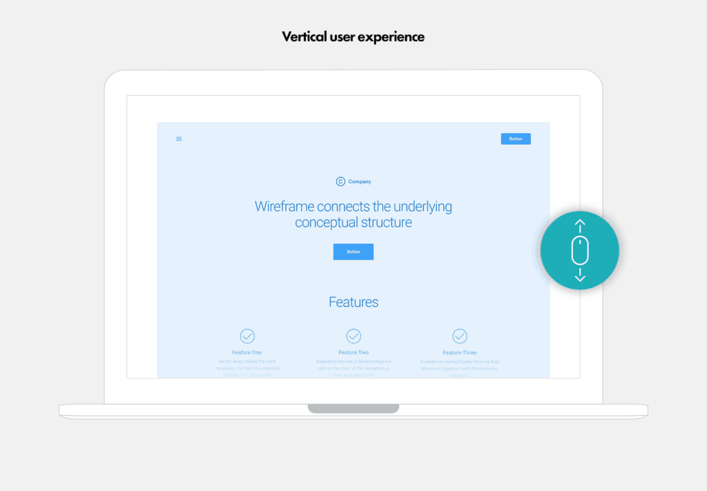
#1Vertical UX
Most websites are designed as a long vertical page where users need to scroll down to view the content. Usually, the content is placed in one long vertical container. The users can interact with the user interface using the mouse wheel and the directional keyboards to scroll down and up the page.
There’s nothing wrong with using the vertical user experience, particularly as it’s very widely adopted and familiar to users. But it’s fun to mix it up now and then when a project lends itself to a more creative approach! There are many alternative framework concepts to discover and build on so let’s dive in and explore the alternatives to the standard vertical scroll user experience.
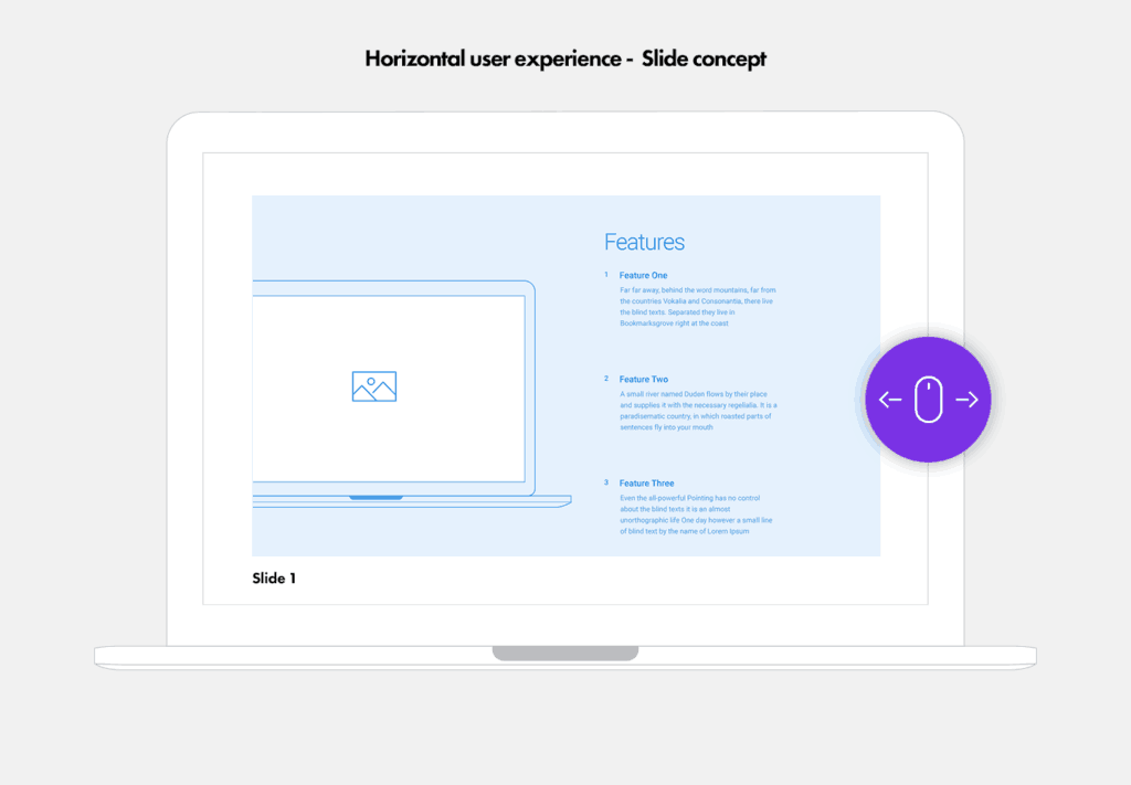
#2Horizontal UX
The most common alternative to the vertical experience is the horizontal layout which can be developed in different ways and there can be various user experiences depending on the technology that you use to bring the design to life.
Here’s an example of horizontal UX from one of our case studies for a WordPress Multisite that we built for MRI Software.
The horizontal user experience allows the users to scroll the content left/right instead of up/down. Here’s another example of how we have used the horizontal layout for a case study for one of our charity sector clients Nacro.
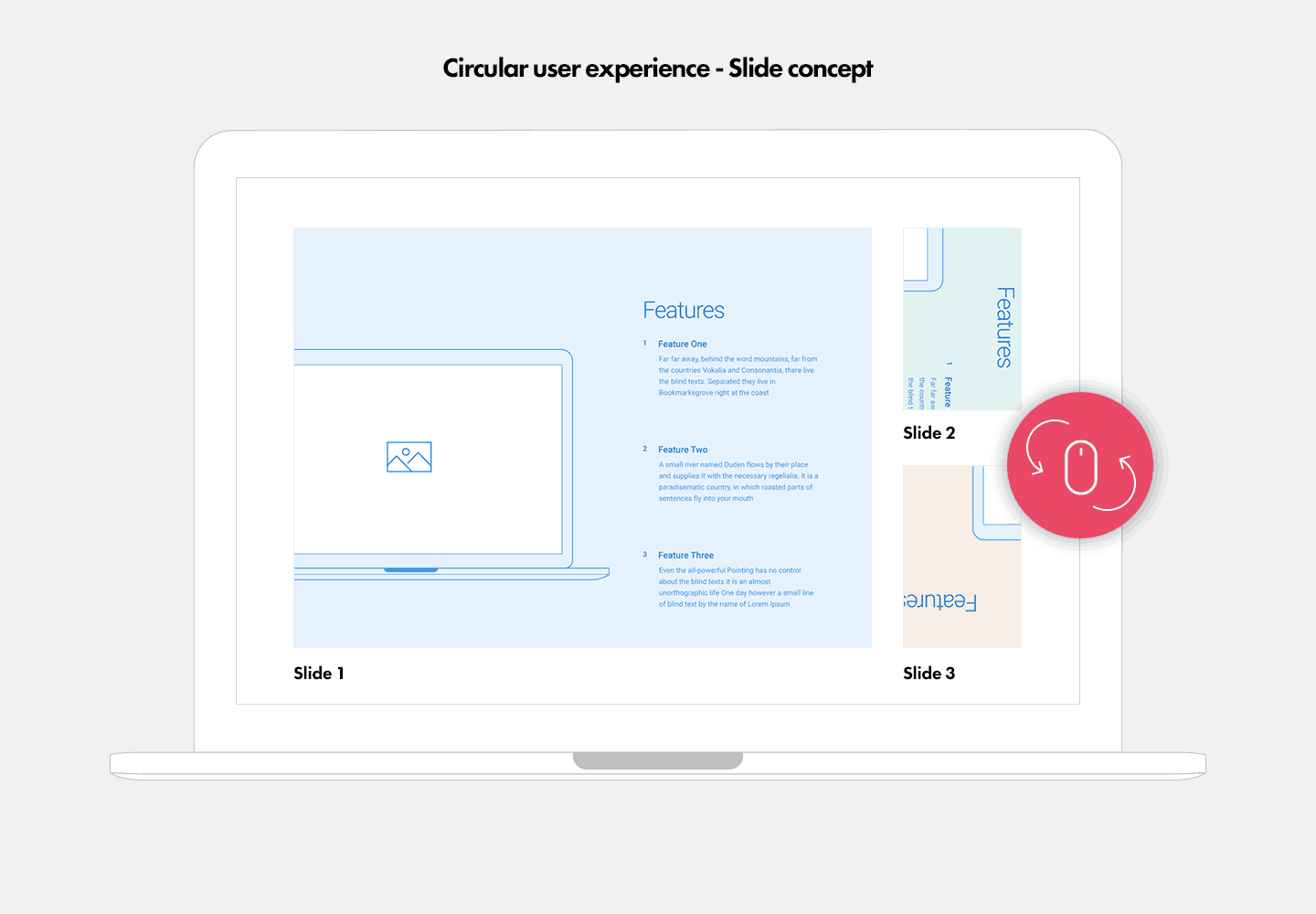
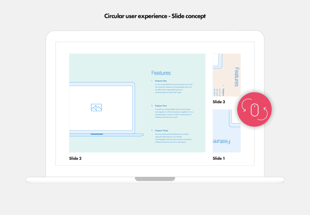
#3Circular UX
Another quite interesting user experience that we really like uses a circular motion in a fixed container. It’s based on the slide concept that we highlighted above in the horizontal layout but the motion of the slides is circular rather than horizontal which we think looks pretty cool!
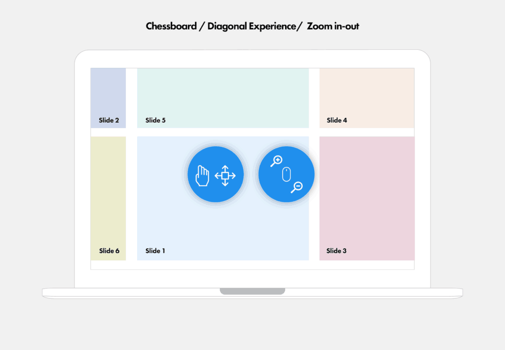
This is a really fun framework with a layout kind of like a giant chess board where the user can navigate in multiple directions across the page and can zoom in and out – a really playful way to engage with the user.
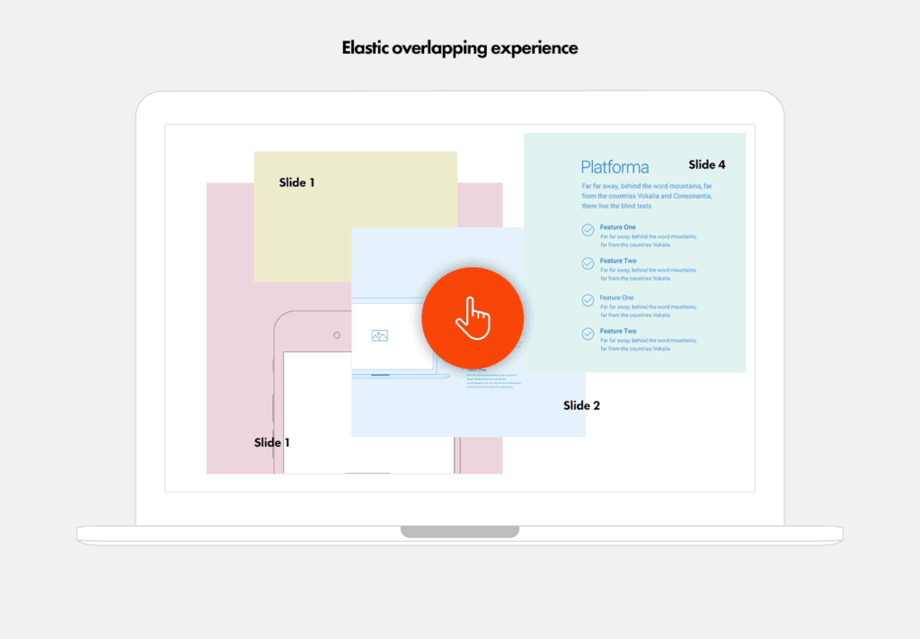
The elastic overlapping user experience has a series over overlapping screens that invite the user to explore as the narrative unfolds. This is a nice example of intuitive and engaging storytelling, we love it!
We’re inspired every day by the creativity on the web and we like to have fun with our projects and create compelling stories. If you have a project that needs a creative approach then please get in touch – we’d love to help!